TabStrip Tutorial
We will build a simple app that hosts animating tab selection component in this tutorial. It is inspired by Cuberto's Animated Tabbar and this JS impl. This app will be multi-platform, which means it will run in the browser and as a desktop application.
The main focus will be utilizing Doodle's powerful animation APIs to create smooth transitions with precise timings.
You can also see the full-screen app here: JavaScript, WebAssembly.
Project Setup
The app will use a Kotlin Multiplatform setup, which means we can run it on a range of targets supported by Doodle. The directory structure follows a fairly common layout, with common classes and resources in one source set and platform-specific items in their own.
- kotlin
- jsMain
- jvmMain
- wasmJsMain
- build.gradle.kts
All source code and resources are located under the src directory.
The application logic itself is located in the common source set (src/commonMain), which means it is entirely reused for each platform. In fact, the same app is used unchanged (just targeting JS) within this documentation.
Source code and resources for that are usable for platforms are stored in commonMain. This app is designed to work on all platforms, so our app code and all logic is found under this directory.
The kotlin directory is where all code for a platform resides. In this case, we have all the classes for our app: TabStripApp and TabStrip.
All of these classes are platform agnostic and used by all targets. This makes our app work on any target Doodle supports.
Source code and resources that are needed for Web (JS) target are stored in jsMain. Our app is platform agnostic except for the launch portion, which is located in the source below this directory.
The Web launch portion of our app is located here in the program's main function.
Holds the index.html file that loads the generated JS file produced for the Web (JS) target.
Source code and resources that are needed for Desktop (JVM) target are stored in jvmMain.
The Desktop launch portion of our app is located here in the program's main function.
Source code and resources that are needed for Web (WASM) target are stored in wasmJsMain. Our app is platform agnostic except for the launch portion, which is located in the source below this directory.
The Web launch portion of our app is located here in the program's main function.
Holds the index.html file that loads the generated JS file produced for the Web (WASM) target.
The build.gradle.kts file defines how the app is configured and all its dependencies. The TabStrip app uses a multi-platform configuration so it can run on all Doodle supported targets.
Doodle apps are built using gradle like other Kotlin apps. The build is controlled by the build.gradle.kts script in the root of the TabStrip directory.
build.gradle.kts
@file:Suppress("OPT_IN_USAGE")

import org.jetbrains.kotlin.gradle.dsl.JvmTarget.JVM_11


//sampleStart
plugins {
    kotlin("multiplatform")
}

kotlin {
    js     { browser { binaries.executable() } }                               // Web     (JS  ) executable
    wasmJs { browser { binaries.executable() } }                               // Web     (WASM) executable
    jvm    {                                                                   // Desktop (JVM ) executable
        compilerOptions { jvmTarget.set(JVM_11) }                              // JVM 11 is needed for Desktop
        mainRun         { mainClass.set("io.nacular.doodle.examples.MainKt") } // Desktop entry point
    }

    sourceSets {
        // Source set for all platforms
        commonMain.dependencies {
            api(libs.doodle.animation)
        }

        // Web (JS) platform source set
        jsMain.dependencies {
            implementation(libs.doodle.browser)
        }

        // Web (WASM) platform source set
        val wasmJsMain by getting {
            dependencies {
                implementation(libs.doodle.browser)
            }
        }

        // Desktop (JVM) platform source set
        jvmMain.dependencies {
            // helper to derive OS/architecture pair
            when (osTarget()) {
                "macos-x64"     -> implementation(libs.doodle.desktop.jvm.macos.x64    )
                "macos-arm64"   -> implementation(libs.doodle.desktop.jvm.macos.arm64  )
                "linux-x64"     -> implementation(libs.doodle.desktop.jvm.linux.x64    )
                "linux-arm64"   -> implementation(libs.doodle.desktop.jvm.linux.arm64  )
                "windows-x64"   -> implementation(libs.doodle.desktop.jvm.windows.x64  )
                "windows-arm64" -> implementation(libs.doodle.desktop.jvm.windows.arm64)
            }
        }
    }
}
//sampleEnd

// could be moved to buildSrc, but kept here for clarity
fun osTarget(): String {
    val osName = System.getProperty("os.name")
    val targetOs = when {
        osName == "Mac OS X"       -> "macos"
        osName.startsWith("Win"  ) -> "windows"
        osName.startsWith("Linux") -> "linux"
        else                       -> error("Unsupported OS: $osName")
    }

    val targetArch = when (val osArch = System.getProperty("os.arch")) {
        "x86_64", "amd64" -> "x64"
        "aarch64"         -> "arm64"
        else              -> error("Unsupported arch: $osArch")
    }

    return "${targetOs}-${targetArch}"
}
The gradle build uses gradle version catalogs; see libs.versions.toml file for library info.
The Application
All Doodle apps must implement the Application interface. The framework will then initialize our app via the constructor. Our app will be fairly simple: just create an instance of our calculator and add it to the display.
Doodle apps can be defined in commonMain, since they do not require any platform-specific dependencies (we will do this as well). They can also be launched in a few different ways on Web and Desktop. Use the application function in a platform source-set (i.e. jsMain, jvmMain, etc.) to launch top-level apps. It takes a list of modules to load and a lambda that builds the app. This lambda is within a Kodein injection context, which means we can inject dependencies into our app via instance, provider, etc.
package io.nacular.doodle.examples

import io.nacular.doodle.animation.Animator
import io.nacular.doodle.application.Application
import io.nacular.doodle.core.Display
import io.nacular.doodle.geometry.PathMetrics
import io.nacular.doodle.geometry.Size
import io.nacular.doodle.layout.constraints.center
import io.nacular.doodle.layout.constraints.constrain

/**
 * Simple app that places a [TabStrip] at the center of the display.
 */
//sampleStart
class TabStripApp(display: Display, animator: Animator, pathMetrics: PathMetrics): Application {
    init {
        // creat and display a single TabStrip
        with(display) {
            this += TabStrip(animator, pathMetrics).apply {
                suggestSize(Size(375, 100))
            }

            layout = constrain(first(), center)
        }
    }

    override fun shutdown() { /* no-op */ }
}
//sampleEnd
Notice that shutdown is a no-op, since we don't have any cleanup to do when the app closes.
The TabStrip View
This tutorial will implement the TabStrip as a single View that manages its state directly. This lets us focus on the animation logic.
A production version of this control would be more flexible if it let you pass in the items in the tab and configure what each does when clicked.
The TabStrip is composed of a rounded rectangle background (with a drop-shadow), a row of items rendered using paths, an indicator that looks like a wave, and a droplet that appears during a new tab selection. All of these elements are rendered directly onto the TabStrip's canvas, so there are no child Views involved for this approach.
Render Logic
All parts of the view are rendered in TabStrip.render, which is how all Views draw themselves.
override fun render(canvas: Canvas) {
  val foreGround = (foregroundColor ?: Black).paint
  val backGround = (backgroundColor ?: White).paint

  // draw shadow
  canvas.outerShadow(color = Black opacity 0.1f, blurRadius = 20.0) {
      // draw background rounded rect
      canvas.rect(bounds.atOrigin, radius = cornerRadius, fill = backGround)
  }

  // draw items
  items.forEach { item ->
      val itemScale = 1 - itemScaleChange * item.moveProgress

      // position and scale the item
      canvas.transform(Identity.
          translate(Point(item.x, item.y + itemDipOffset * item.moveProgress)).
          scale(around = Point(item.width / 2, item.height / 2), itemScale, itemScale)) {

          when (item.selectionProgress) {
              1f   -> path(item.selected, fill = foreGround) // fully selected
              else -> {
                  path(item.deselected, fill = foreGround)

                  if (item.selectionProgress > 0f) {
                      // overlay transition if partially selected
                      val dropletCircle = Circle(
                          center = Point(item.width / 2, item.height - dropLetRadius),
                          radius = dropLetRadius + (max(item.width, item.height) - dropLetRadius) * item.selectionProgress
                      )

                      // overlay background fill so it seeps through holes in item
                      circle(dropletCircle, fill = backGround)

                      // draw selected item clip to droplet
                      clip(dropletCircle) {
                          path(item.selected, fill = foreGround)
                      }
                  }
              }
          }
      }
  }

  canvas.translate(indicatorCenter) {
      // draw indicator
      path(indicatorPath, fill = foreGround)

      if (dropletYAboveIndicator != 0.0) {
          // draw droplet so that it's top is at the indicator top when dropletYAboveIndicator == 0
          circle(Circle(
              radius = dropLetRadius,
              center = Point(0, -indicatorHeight + dropLetRadius - dropletYAboveIndicator)
          ), fill = foreGround)
      }
  }
}
Notice that the icons and indicator are all drawn after the canvas has been transformed. That is because paths are fixed in space (in our case they are all anchored at 0,0) and moving them around on a Canvas requires a transform.
You can also see that each icon can be in 1 of 3 states: deselected, partially selected, fully selected. In the first and last case, only the respective path is drawn. But in the transitional state, both paths are drawn, with the selected path being clipped to the droplet circle. We also need to change the background color that leaks through the holes of the path. So a filler circle is drawn before the selected path with the current background fill.
Many of the parameters used in render are ones we will animate (i.e. icon.moveProgress, icon.selectionProgress, indicatorCenter, dropletYAboveIndicator, etc.). Therefore, animation can simply trigger renders to ensure the TabStrip always reflects the changes on every tick.
Triggering The Animation
This component has a complex set of animations that will trigger in a specific sequence to achieve the final look. We will use an injected Animator names animate to perform all animations. And we will tie animations to click events that select a new item.
The first thing we'll do is track the selectedItem as an observable property so we can trigger animations when it changes:
private var selectedItem by observable(items.first()) { _,selected -> ... }
This item will be initialized to the first item in our list. That list will simply be hard-coded for this tutorial. It tracks data for each item in a simple data object.
private inner class ItemState(val selected: Path, val deselected: Path, var selectionProgress: Float = 0f) {
  val x          get() = position.x
  val y          get() = position.y
  val width      get() = size.width
  val height     get() = size.height
  val centerX    get() = x + width / 2
  val size             = pathMetrics.size(selected)
  val atDefaults get() = selectionProgress == 0f && moveProgress == 0f

  lateinit var position     : Point
           var moveProgress = 0f
}
The user is able to change selectedItem by clicking on it with the Pointer. We track this by listening to click events on the view directly and deciding which item is selected. We also listen for pointer move events to handle the dynamic cursor, which shows a Pointer when hovering over a non-selected item.
init {
  // ...

  // Listen for item clicks
  pointerChanged += clicked { event ->
      getItem(at = event.location)?.let {
          selectedItem = it
          cursor       = Default
      }
  }

  // Update cursor as pointer moves
  pointerMotionChanged += moved { event ->
      cursor = when (getItem(event.location)) {
          selectedItem, null -> Default
          else               -> Pointer
      }
  }
}
The result is that clicking on an item other than selectedItem will trigger our observable callback, which is where we do our animation handling.
Animation Timeline
This is what the full animation timeline looks like. The diagram shows the sequence of events and their timings (to scale).
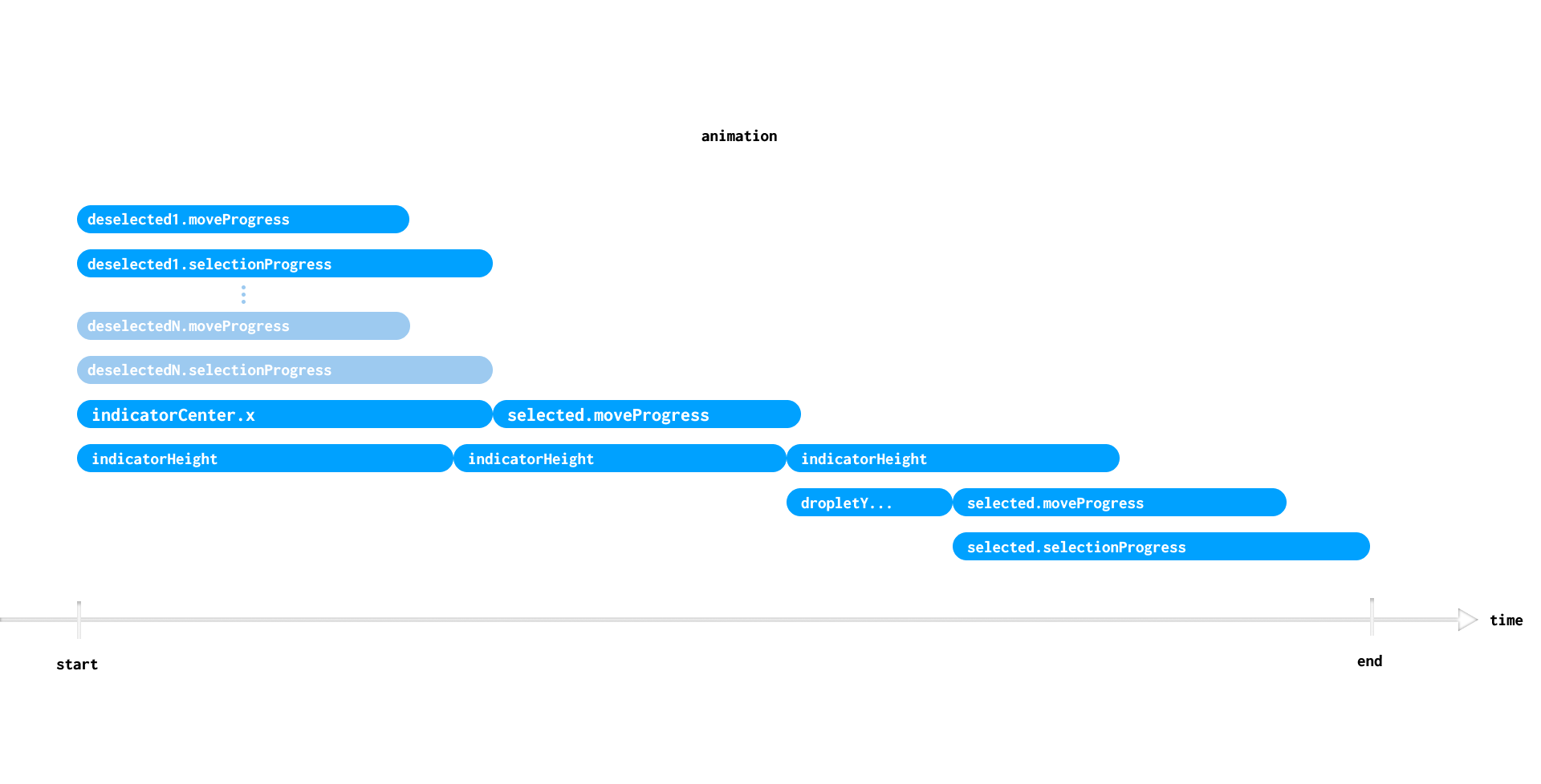
There are a few important things to note about our approach. First is that we are using an animation block and tracking several top-level animations that will run concurrently via animations. This allows us to auto-cancel them whenever a new animation starts. We accomplish this by defining animations as an autoCanceling property
private var animation: Animation<*>? by autoCanceling()
Use the autoCanceling delegate to get free animation cleanup whenever a new value is assigned to an old one.
Secondly, our approach initiates a lot of follow-on animations at the completion of previous animations (bubbles that come after others). These are triggered using the then method on the animation they follow. This allows them to be tracked by our top-level animation block and they are only created when the previous animation completes.
Doodle's animation block captures any animations created while the block is being executed and groups them all under a single animation returned from the block. In the following example, all the animations will be tied to animations, so canceling it cancels everything.
All animations rolled into the result
val animations = animate {
  0f to 1f (using tweenFloat(...)) {}
  a  to b  (using tweenColor(...)) {} then {
      ...
  }

  subAnimation = animate {
      ...
  }
}
NOTE that you must use then if you'd like to create subsequent animations at the completions of others. Doing the following will not track the animation created in the completed callback.
Some animations not tracked
val animations = animate {
  (0f to 1f using tweenFloat(...).invoke {}).apply {
      completed += {
          // this one not, since it is created after the animate block is finished
          a  to b  using tweenColor(...).invoke {}
      }
  }
}
Animation Logic
The following code has all of the logic to cancel anything that is ongoing when it fires and setup the timeline.
private var selectedItem by observable(items.first()) { _,selected ->
  // hide droplet
  dropletYAboveIndicator = 0.0

  // Animation blocks roll all top-level animations (those created while in the block) into a common
  // parent animation. Canceling that animation cancels all the children.
  animation = animate {
      // All deselected items move back to normal
      items.filter { it != selected && !it.atDefaults }.forEach { deselected ->
          deselected.moveProgress      to 0f using (tweenFloat(linear, itemMoveUpDuration)) { deselected.moveProgress      = it }
          deselected.selectionProgress to 0f using (tweenFloat(linear, itemFillDuration  )) { deselected.selectionProgress = it }
      }

      // Indicator moves to selected item
      indicatorCenter.x to selected.centerX using (tweenDouble(easeInOutCubic, slideDuration)) { indicatorCenter = Point(it, height) } then {
          // Selected item moves down
          selected.moveProgress to 1f using (tweenFloat(linear, itemMoveDownDuration)) { selected.moveProgress = it }
      }

      // Indicator primes as it travels to selected item
      indicatorHeight to minIndicatorHeight using (tweenDouble(linear, primeDuration)) { indicatorHeight = it } then {
          // Indicator fires at selected item
          indicatorHeight to maxIndicatorHeight using (tweenDouble(linear, fireDuration)) { indicatorHeight = it } then {
              // Indicator height returns to normal
              indicatorHeight to defaultIndicatorHeight using (tweenDouble(linear, recoilDuration)) { indicatorHeight = it }

              // Droplet moves up to item
              dropletYAboveIndicator to dropletMaxY using (tweenDouble(linear, dropletTravelDuration)) { dropletYAboveIndicator = it } then {
                  // Droplet is instantly hidden
                  dropletYAboveIndicator = 0.0

                  // Selected item moves up
                  selected.moveProgress to 0f using (tweenFloat(linear, itemMoveUpDuration)) { selected.moveProgress = it }

                  // Selected item animates droplet within it
                  selected.selectionProgress to 1f using (tweenFloat(linear, itemFillDuration)) { selected.selectionProgress = it }
              }
          }
      }
  }
}
Rendering On Animation
Our animations change many internal variables as they update. These variables all affect how the control is rendered, and therefore need to trigger re-render so their states are constantly in sync with what the control shows at any moment. One option is to have these variables be renderPropertys. This would trigger a render call whenever any of them is changed. This approach is fine for cases where only a small number of properties will change at a time; then the number of render calls remains low. Doodle does queue calls to rerender, but its best to avoid making those calls to begin with if possible.
So we take a different approach. The Animator interface lets you listen to changes to active animations. These events are fired in bulk whenever any animations change, complete, or are canceled. This is a great way to take action at low cost. The code for this is as follows:
init {
  // ...

  // Rerender on animation updates
  animate.listeners += object: Listener {
      override fun changed(animator: Animator, animations: Set<Animation<*>>) {
          rerenderNow() // only called once per animation tick
      }
  }

  // ...
}
With this, our component will render itself and listen to pointer events so it can trigger animations.
Potential Improvements
We focused on the animation logic in this tutorial, but there are other things the TabStrip needs to manage given how we've chosen to implement it. These include managing how all the items it draws are positioned relative to its own size.
The approach we chose requires the component to recalculate the offsets of all paths it draws whenever its size changes. That's because everything drawn during render is absolutely positioned on the canvas.
A more production-ready approach might have the component only draw the indicator on its canvas, while having the items as child views. Then it could use a Layout to keep the item positions up to date. Of course, that layout would need to participate in the animation and incorporate the animating values into its positioning logic. But this approach would scale better and allow the control to house a more dynamic set of items.